
CrushOn AI is one of the more visible names in the character-AI chat space, particularly among users looking for roleplay-driven experiences rather than productivity tools. At first glance, the platform makes its positioning very clear. It is not trying to be a general assistant. It is built for immersive character interaction, and it signals that immediately.
This walkthrough focuses strictly on the first-look user experience of crushon.ai, based on observable behavior and interface patterns. The goal is to understand what a new user actually encounters in the first few minutes and where the experience feels smooth versus slightly rough around the edges.
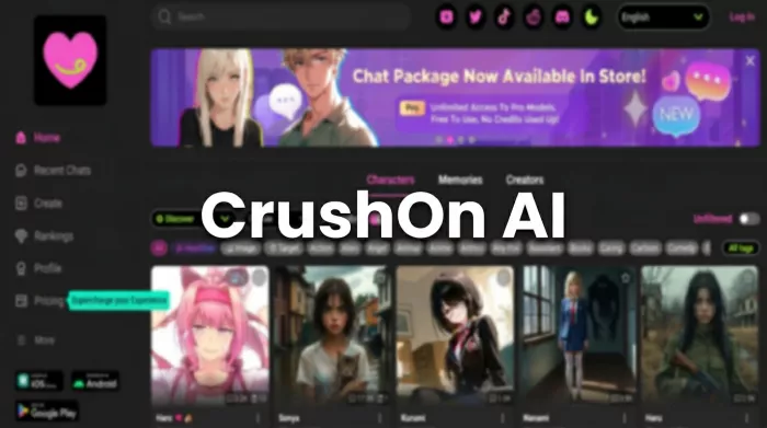
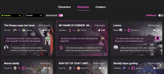
The moment you land on crushon.ai, the visual hierarchy does most of the talking. The homepage is dominated by a large grid of AI character cards featuring stylized anime and fantasy portraits, each paired with a short teaser line.
There is very little introductory copy explaining the platform in depth. Instead, the design communicates a simple instruction: pick a character and start chatting.
• Character cards are the primary focus
• Branding language leans heavily toward “unfiltered” positioning
• Visual style favors anime and fantasy aesthetics
• Explanatory product messaging is minimal
The tone is niche and direct. Within seconds, it is obvious the platform is targeting adults interested in roleplay-driven AI chat, particularly users already familiar with fandom culture. There is no slow warm-up here. The site gets to the point quickly.
From a navigation standpoint, the public experience is intentionally minimal. Users can scroll through the character grid freely without creating an account, which provides a basic preview layer.
However, the depth of public exploration is limited.
| Section | Availability | Depth |
| Character grid | Open | Scrollable but shallow |
| Pricing page | Open | Basic tier overview |
| Privacy policy | Open | Standard legal page |
| Blog posts | Limited | Occasional updates |
| Feature documentation | Not prominent | Minimal |
The site behaves more like an app shell than a traditional information-rich website. You can browse, but meaningful interaction is clearly meant to happen after signup.
Net effect: browsable but intentionally shallow.
CrushOn AI uses what could be described as a soft gate.
You are not forced to log in immediately to look around, but the moment you try to actually chat, the signup wall appears. The transition is quick and expected for this category.
• Email based registration with verification
• Fast redirect into the AI bot section after login
• No visible hard identity verification
• 18+ content toggle available in settings
There is no heavy onboarding funnel. The platform prioritizes speed over hand-holding. If you blink, you are already inside the bot library.
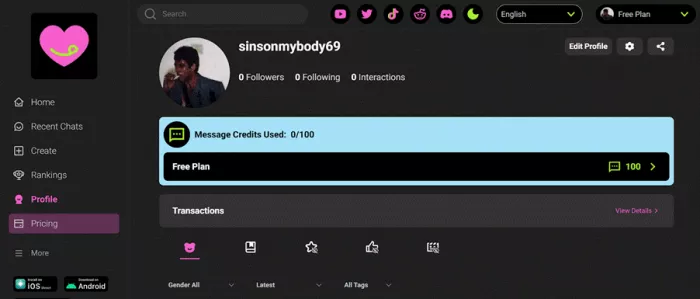
The platform operates on a permanent free tier rather than a traditional time-limited trial. On paper, the free plan is usable. In practice, it is clearly constrained.
Free tier snapshot
| Feature | Free Access |
| Monthly messages | 100 |
| Memory context | 8K |
| Models available | Free tier only |
| Memory persistence | Cleared after 7 days inactivity |
| Group chat | Locked |
| Premium models | Locked |
Users can extend usage slightly by earning in-platform coins through daily actions, but heavy roleplay sessions will hit limits quickly.
Reality check: the free tier works for light experimentation, not sustained use.
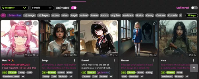
Character discovery is one of CrushOn AI’s strongest and messiest areas at the same time.
The library is large and entirely community driven, which creates variety but also inconsistency.
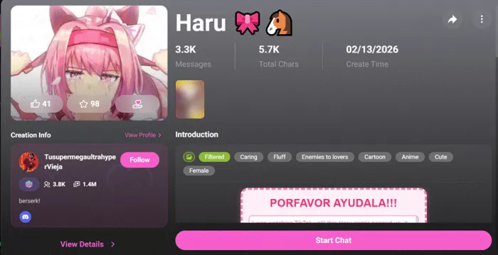
Each character card typically includes:
• Stylized portrait
• Character name
• Short personality hook
• Tag indicators
Users can filter by tags such as:
There is also a search function and sorting options like trending and recent.
• Large and diverse character pool
• Easy visual scanning
• Tag based filtering works well
• Swipe discovery exists on mobile
• Library can feel cluttered
• Quality varies widely between bots
• Curation is lighter than some competitors
It is a bit like walking into a massive anime convention. There is something for everyone, but you may need a minute to find your seat.
Once inside a conversation, the experience becomes noticeably smoother. The chat interface follows a familiar instant messaging layout with continuous scroll and clear message separation.

• AI often opens with a scenario or greeting
• Conversation flow is continuous and fast
• Interface is clean and readable
• Scrolling performance is generally smooth
This is clearly the platform’s strongest UX zone.
In-Chat Controls and Power Features
Inside the chat environment, users gain access to a surprisingly deep set of controls.
• Model selection (varies by plan)
• Message editing and branching
• Rewind to earlier conversation points
• Creativity slider (temperature)
• Maximum response length control
• Image upload support
• Scene Card background customization
• Pin important messages
• Memory save and load controls

There is also a social layer called Memories, which allows sharing chat moments publicly.
For power users, this is where the platform starts to feel more sophisticated than the landing page suggests.
No first-look review would be complete without noting the rough edges. Based on user feedback and teardowns, several friction points appear consistently.
• Many advanced features sit behind paywalls
• Free message cap is reached quickly
• Memory deletion after inactivity can surprise users
• Model selection can be confusing at first
• Pricing tiers are not always explained clearly
• Some UI elements feel dense for first-time users
None of these are fatal flaws, but they do create a mild learning curve.
Taken together, CrushOn AI delivers a gated but functional first experience. The browsing layer is open enough to spark interest, while the real product sits just behind account creation and usage limits.
The core chat loop feels polished and purpose built for continuous roleplay. Where the platform shows strain is in clarity around pricing, feature discovery, and memory behavior.
• Anime and fandom oriented adults
• Users already familiar with character AI tools
• Roleplay focused communities
• Casual AI experimenters
• Users seeking productivity tools
• Privacy sensitive newcomersFinal Take
CrushOn AI knows exactly what audience it is targeting, and it does not waste time pretending otherwise. The first-look experience is visually clear, fast to enter, and strongest once you reach the chat interface.
At the same time, the platform is unmistakably gated. The free tier is limited, advanced features are paywalled, and some UX elements require a bit of exploration to fully understand.
If you arrive expecting a polished roleplay environment, the core experience will likely meet expectations. If you arrive expecting a fully open sandbox, the message limits and locked features will make themselves known fairly quickly.

Most investors building around AI stocks are chasing growth, and that...

Artificial intelligence is changing how we use video. It used to be a...

If you look at how digital content is made today, everything moves inc...

Let’s be entirely honest about the modern corporate environment: nobod...

AI video generators create ads from product photos by first understand...
Google is officially retiring Veo as the default video model inside th...
Discussion