In today’s fast-moving digital world, visuals do most of the talking. Whether someone lands on your website, scrolls through social media, or opens an email campaign, banners are often the first thing they notice. And that first impression? It can make or break engagement in just a few seconds.
A well-designed banner doesn’t just “look nice”, it communicates value, builds trust, and guides the viewer toward action. But creating something that is both visually appealing and strategically effective requires more than dragging elements onto a canvas. It’s about understanding design principles, audience behavior, and storytelling through visuals.
If you’ve ever struggled with where to begin, tools like banner creator make the process significantly easier by combining templates, customization features, and intuitive design controls that help both beginners and professionals bring ideas to life without friction.
Banners are not just decorative elements; they are marketing tools. Whether used for promotions, announcements, branding, or advertising campaigns, they play a direct role in user engagement.
Think about a retail website during a seasonal sale. The banner at the top is usually what grabs attention first. If it’s poorly designed, cluttered, or unclear, users may ignore it completely, even if the offer underneath is great.
On the other hand, a clean and well-structured banner can guide the viewer’s attention instantly. It sets the tone for the entire user experience.
In digital marketing, banners also serve as visual anchors. They reinforce brand identity through colors, typography, and imagery. Over time, this consistency builds recognition, and recognition builds trust.
Creating a strong banner is not about adding more elements; it’s about using the right ones strategically.
A banner should communicate one main idea. Whether it’s a discount, announcement, or call-to-action, clarity always wins over complexity. Users should understand the message within seconds.
Not all elements are equal. The most important part of your banner — usually the headline or call-to-action — should stand out. This can be achieved through size, contrast, and positioning.
Colors influence emotion. For example, blue often communicates trust, red creates urgency, and green suggests growth or positivity. A well-balanced palette ensures readability while reinforcing brand personality.
Blurry or generic images weaken credibility. Strong visuals should support the message, not distract from it.
A banner without direction is just decoration. Phrases like “Shop Now,” “Learn More,” or “Get Started” guide users toward the next step.
Even if you’re not a designer, you can create professional-looking banners by following a structured approach.
Before opening any design tool, ask yourself: What is this banner supposed to achieve? Is it driving sales, announcing something, or building awareness?
A banner for teenagers promoting fashion will look very different from one targeting corporate professionals. Knowing your audience helps shape tone, color, and style.
Start with a simple structure. Avoid overcrowding. A clean layout ensures your message remains the focal point.
Place your headline, supporting text, and visuals strategically. Make sure everything has breathing space.
Before publishing, preview your banner on different devices. What looks good on a desktop might feel cluttered on mobile.
Even experienced marketers make mistakes when designing banners. Here are a few to watch out for:
Trying to say too much is one of the fastest ways to lose attention. Stick to one core message.
Fonts should be readable and consistent with your brand identity. Decorative fonts can work in moderation, but they should never compromise clarity.
A significant portion of users browse on mobile devices. If your banner doesn’t scale properly, you lose impact instantly.
If your text blends into the background, your message gets lost. Always ensure strong contrast between elements.
Imagine a small online clothing brand launching a weekend sale. They create two banners.
The first one is cluttered: multiple fonts, too many colors, and several competing messages. Users glance at it and move on.
The second banner is simple: a bold headline saying “Weekend Sale – Up to 50% Off,” a clean background image, and a clear “Shop Now” button. Within hours, engagement increases significantly.
The difference isn’t the offer — it’s the presentation.
This is the power of thoughtful banner design. It turns attention into action.
If you want to take your banner designs to the next level, here are some practical insights used by professionals:
These small adjustments can dramatically improve how your banners perform.
Banner design is more than just a creative exercise — it’s a strategic communication tool that directly influences how audiences perceive and interact with your brand. When done right, it captures attention instantly, delivers a clear message, and drives meaningful action.
The key is balance: simplicity in design, clarity in messaging, and consistency in branding. With the right approach and tools, anyone can create banners that don’t just look good but actually perform well in real-world marketing scenarios.
In a digital space where attention is limited and competition is high, strong banner design isn’t optional, it’s essential.
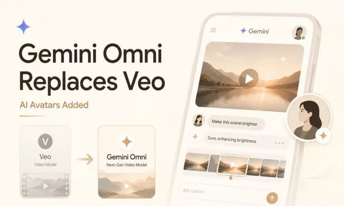
Google is officially retiring Veo as the default video model inside th...
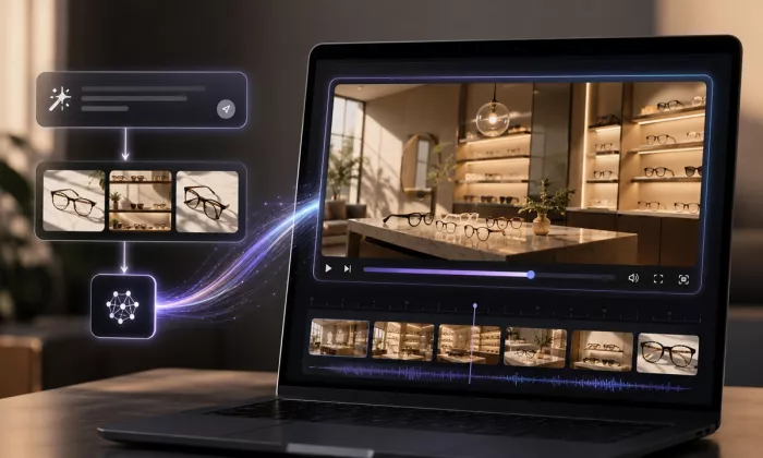
AI image and video tools have made visual creation much faster.A creat...
Testing noteI originally wanted to test Seedance 2.5, but it was not f...
SpaceX is usually associated with rockets, satellites, and interplanet...
Anthropic has introduced Claude Sonnet 5, its new mid-tier AI model de...
Nastia AI and Candy AI are two of the more talked-about AI companion p...

Discussion